
Big Fish Games: TackleBox
Campaign Management For Mobile Games
Overview
Big Fish Games began an initiative to build an in-house, enterprise live ops management platform custom-tailored to support its expansive portfolio of casual mobile games by seamlessly integrating with its mobile game SDK platform.
This project was the first of many, and I was tasked with designing the MVP for a digital product that would provide in-house marketing teams with a better way to schedule push notifications and in-app marketing campaigns.
Role
Product Designer
User Research, Interaction Design, Visual Design, Prototyping & Testing
Dec 2015
Background
Big Fish Games both develops and produces games, with a massive assortment of titles for the casual game market. While they have representation in many genres, they are well-known for possibly having the most extensive portfolio of hidden object games, localized for several languages and geographic regions.

I joined Big Fish Games as a product designer in 2014 as one of two UX designers in a company with hundreds of developers, product managers, game designers, and many of other game design support staff. Before TackleBox was ever conceived, I was hired to support design for the company’s e-commerce site, mobile marketplace, and download manager software. I was responsible for leading UX and UI across crucial parts of these experiences, and I was later promoted to UX Manager as the team grew in size.
Some key achievements of mine during my time at Big Fish Games include:
Formalized our team’s design process. Implementing design thinking practices allowed my team to work more efficiently and empathetically. This was the first step in establishing design ops at Big Fish Games.
Shifted to be user-first. Usability testing wasn’t a common practice when I came on. I made it a professional goal to change minds and hearts to rely on user research and usability testing to make project decisions.
Defined a design system. This helped create a consistent look and feel and helped both product designers and engineers know which components to use when, where, how, and why.
The Process
While I had established the double-diamond design process with the other engineering teams I’d worked with, I was thrust onto this project near the end of the development process. As a result, one of the challenges of this project was to make the UI as usable as possible in a way that would require little to no changes to the backend code for the existing tool. Moving forward, I worked with these engineers before additional development began to ensure alignment and to design within the technical limitations of the SDK and databases.

Understanding The Problem
Before I was even hired, a team of engineers had built several tools meant to smooth the ongoing operations of managing our collection of mobile games. However, they were built without a deep understanding of the needs of the end-users or what features they needed to support.
As a result, our marketing teams continued using 3rd part SaaS solutions that came with numerous issues of their own. I conducted research interviews with our marketing managers to better understand their workflow.
My research findings included:
Understanding the user goals and needs
Uncovering existing friction points and frustrations
Determining areas of opportunity

Gathering Insights
After the initial interviews, I supplemented my knowledge by auditing existing tools from competing solutions. I assembled a few focus groups for individual studios to understand their pipeline and how they collaborated. I worked with my product manager to aggregate the findings using affinity mapping. We compiled the outcomes by clustering problems around common themes and features.
While there were clear trends, each team had its challenges. One team, for example, had a high volume of games they maintained. Yet they were delivering the same messaging campaigns in their entire catalog. Another team worked with 3rd party developers and often needed help guiding their partners in adhering to consistent naming conventions.
Next, I led a prioritization workshop with our larger team and stakeholders to gain consensus on the urgency of specific feature requests.
The output was a concise feature list for the MVP. We could also document a backlog of features for future releases with clear priorities.

Prioritizing Issues
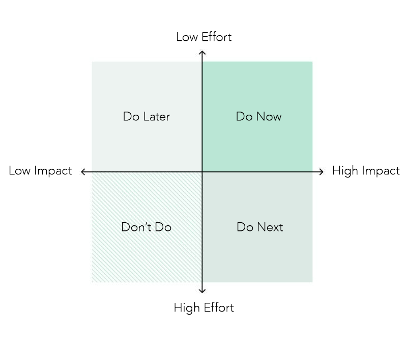
I documented our backlog using a framework based on Jack Moffett’s book, Eliminate UX Debt. In his book, Moffett recommends considering these factors to determine priority:
severity/impact x effort x responsible party = priority
Severity/Impact - how much does this issue affect users? Conversely, how much could fixing it help?
Effort - how much work is it to fix this issue? How much would it cost in resources?
Responsible Party - AKA, availability of human resources. Is the person who can fix it free to do so?
For the issues we were going to address as part of the MVP, I created detailed user stories using the format of "As a [user], I need to do [task] in order to get [result/goal]." I also sorted these problems by the touchpoints in the user journey to identify where our focus should be.
Based on the prioritization exercises we completed, our cross-functional team determined that we could make the most significant impact by concentrating on scheduling campaigns for interstitial messaging.

Defining The Problem
Based on the user interviews observing marketing managers using third-party tools, we found the following key issues:
Users waited in agony for the campaign list pages to load, sometimes anywhere from 5-20 minutes
Users wasted time creating hacky workarounds due to a lack of support for multiple languages and other features
Users were frustrated at the lack of advanced creative options
Users craved reassurance and deliberate* friction to avoid the anxiety of publishing campaigns with errors
*Yes, you read correctly! Our users wanted it to be difficult to make mistakes because an error in messaging would be irrevocable.

Wireframing The Solution
Next, I sketched and wireframed multiple solutions and tested the best concepts. Here are some of the ideas that moved onto testing:
Breaking the setup into multiple steps to reduce cognitive load as well as page load times
Updating nomenclature to terminology familiar to users
Enhancing visual hierarchy by grouping related fields in containers
Reducing friction by integrating advanced features into the workflow, such as placement creation and segmentation
Designing an intuitive UI that would support a near-infinite number of campaign assets
Including easy-to-use multi-language support
Providing the option to build advanced interactivity options
Adding a thorough review step before publishing campaigns
Including a reporting page to provide instantaneous feedback
After I created the wireframes, I sought feedback on the design and structure of the form from Product, Engineering, and our users. This included establishing a consistent visual hierarchy and layout for all tools existing and future tools.
Validating The Designs
I conducted usability testing sessions with our users to validate whether the new designs would solve their problems. I wrote a test plan with a scenario asking the user to create a new placement and a campaign with three overlays. The first few rounds of testing were done with paper prototypes, as I worked rapidly to resolve any points of friction that surfaced. As the designs became more refined, so did the prototypes.
During the sessions, I observed how users interacted with the prototype and set up the campaign. The usability session revealed opportunities for fine-tuning. Issues were addressed, and I felt comfortable moving on to high-fidelity mockups when users could complete the scenario without error.

Delivering The Designs
After usability testing, I created the high-fidelity mockups in Sketch. Then, I paired with the project manager to generate a technical specifications document with embedded designs in Confluence.
I led a handoff meeting with the frontend, backend, and QA teams. By reviewing the intended functionality of the tool and backend services needed, these teams could define their own roadmaps and JIRA tickets. It also ensured we were all united in understanding the expected outcome, which made QA very easy.
I worked with the engineering teams to fill in any missed conflicts or gaps during the design process. Once the build was ready for QA, I reviewed it to ensure parity between the designs and execution (UAT).


Results & Takeaways
Since the launch of the newly redesigned TackleBox Messaging tool, we have seen a dramatic increase in adoption rate company-wide. We received frequent feedback from our users that it was a vast improvement compared to the SaaS solutions they had been previously using.
The final iteration achieved an impressive 22% reduction in time-on-task
20+ Big Fish games switched to using TackleBox Messaging for in-game messaging
Marketing costs dropped by nearly $1.2 million/month after being relaunched
Some key takeaways from this project include:
Establish a strategic plan for the MVP launch to manage potential project disruptions from out-of-scope requests and ensure on-time delivery of a quality product.
Continuous user testing is integral even post-development. Regularly seek and incorporate user feedback.
Advocate for the early and regular inclusion of design to minimize rework, as an early understanding of user needs informs both backend and frontend requirements.
Hungry for more?
Check out these projects.
Big Fish Games: TackleBox
Campaign Management For Mobile Games
Big Fish Games: TackleBox
Campaign Management For Mobile Games